Any reviews of the paper? Just go to the review project to submit!
Issue 1,2
Information: Released on September 09 by chongyian
Click HERE to view the paper.
Review by Aim_Fire:
I enjoyed the Scratch Chatter from Issue 1. So much I even wanted joining the
team (but decided not to because of school starting). The first issue was
amazing with nice size, good info, well written articles, great art, etc. I was
really looking forward for another amazing newspaper. But when issue 2 came out,
I was kind of disappointed. It was smaller and there wasn't as much. Also, the
articles weren't as interesting (but that might just be me). I hope you don't
think I'm bashing. It's great!
Review by Andrewjcole( Now member of The Scratch Chatter):
I think that the Scratch Chatter is great for new and fully experienced
Scratchers. I love it and hope you continue doing it. Keep up the great work!
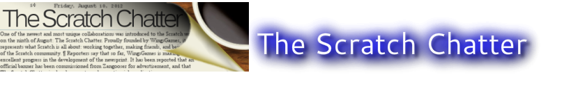
Issue 1,1
Information: Released on August 25 by WingsGames
Click HERE to view the paper.
Reflection by Humhumgames:
Me trying harder.
Really, I will. I wasn't giving 100%, but it will take
longer for me to make it if you want it to be awesome.
My opinion on the issue:
Can we make it the space and arrow keys? Some people seem confused. And the
words have little outlines around them, making the newspaper not look clean. I
agree with others, maybe we should have an ongoing 'The Scratch Chatter' colour
scheme, like The Scratch Times (sky blue and white, font: Impact). Just
saying.
Review by Meapinator101:
Dear Scratch Chatter,
The first edition to your newspaper was simply good. Nothing absolutely amazing
but good. As you know, the scratch chatter has competition with
the Scratch Times, so I want to maximize the level of graphics and writing! I
will grade you on each individual sub-section so be prepared.
First of all I will talk about the writing. The writing was great.
It was on topic and totally true. No grammar or spelling mistakes either.
Well done! This might be about graphics but the font could improve.
You need a original but clear and visible font. Personally I think Scratch Times
might have one this round...
Secondly of all I will talk about graphics. The graphics was good.
It was somewhat plain however, it just had a white backround and black colored text.
I might do some hands on work with that. Maybe we need to double check the graphics section.
Editing was great. Well I found no mistakes so good job! The ideas were good as well!
Keep up the good work!
Lastly, I would like to talk about advertising as well as popularity.
Overall you are a lot more popular than your peers.
Maybe even 6 times as popular than the Scratch times with 1 thread alone!
Nice work...wingsgames takes most of the credit for really advertising! However,
the scratch times is an amazing newspaper. Great art and writing. For them it
is only Agg725 basically so it is a lot more efficient, that is why we stopped
taking members; it would be too much to handle. So you have a lot of catching
up to do overall in terms of the actual newspaper but for now we are well ahead
for popularity.
Grading:
Writing: 8/10 (no comment)
Graphics:5/10 (simple black and white, needs font change.)
Editing: 10/10 (no comment)
Ideas: 9/10 (could be more original....i guess......just trying to make you improve.)
Advertising: 9/10 (keep up momentum)
82/100 = 82%
Review by wolvesstar97
Writing: 8/10
Graphics: 4/10
Editing: 10/10
Ideas: 8/10
Advertising: 9/10
